Reaction to the First Proof of The Templars of Alderath
My reaction to receiving the first Proof Copy of my novel The Templars of Alderath.


After all the work of putting together the paperback for The Templars of Alderath, the first proof showed up on my doorstep—shockingly fast, courtesy of Amazon. One minute I was clicking “order,” the next I was standing there with a plain cardboard box that suddenly felt a lot more important than it should’ve.
I opened it up, pulled the book out, and flipped it over in my hands for a bit.
It’s honestly pretty cool seeing it as an actual, physical book.
That said, this is just the first proof. It’s a milestone, but not the finish line—more like the first real pass at seeing what needs to be fixed.
First Impressions
Flipping through it the first time, I was half expecting to find something catastrophically wrong. You know, the kind of issue that makes you cry and eat five pounds of dark chocolate.
Thankfully, nothing like that showed up.
At a glance, the book works. It looks like a real, professional paperback—something you could see sitting on a shelf and not immediately question. The layout holds together, the cover reads clearly, and overall it does what it’s supposed to do.
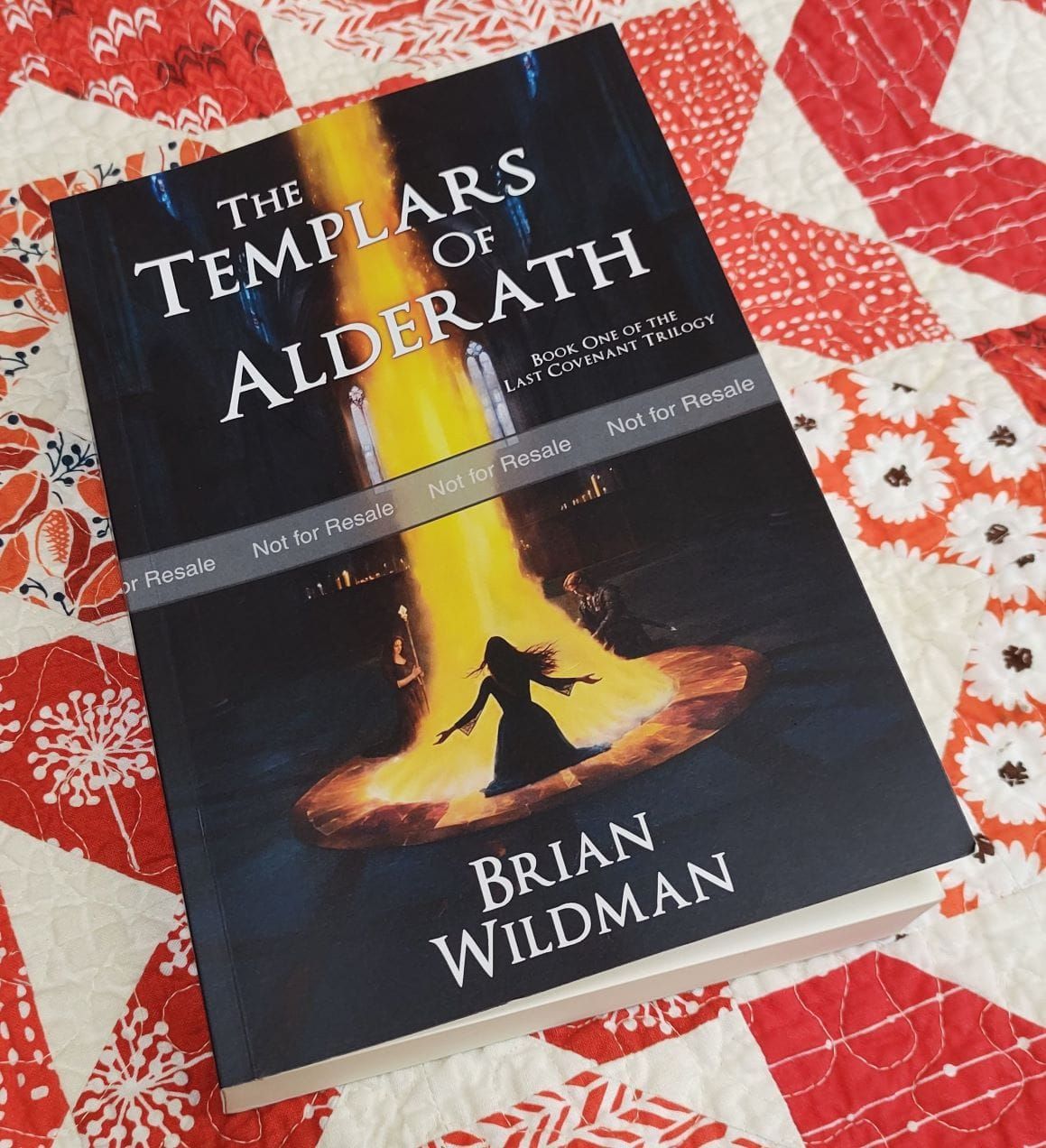
That said, it didn’t take long to start spotting things I’d want to adjust. The biggest one being the cover—it printed a lot darker than expected. Not quite “stare into the void” dark, but definitely not what I was going for.
So the feeling was pretty straightforward: this is going to work. It just needs another pass. Which, for a first proof, is expected and all things considered, I am happy with the result.
What Works
Starting with the good news—the foundation is solid.
The cover design, at its core, is doing exactly what I wanted it to do. The composition, layout, and typography all work together, and the overall look matches what I had in my head going into this. It reads clearly, sets the tone, and communicates the kind of story this is right away. The scene itself was the right call. Out of everything, that’s probably the part I feel best about.
Inside the book, the structure holds up just as well. Everything is where it should be. The chapter headers and graphics land the way I was hoping, and the drop caps pair nicely with them without feeling overdone.
More than anything, it feels like the book I set out to make.
That’s really the key point here—this isn’t a rebuild situation. The bones are good. Now it’s just a matter of tightening things up and getting it to look as good in print as it does in my head.
What Doesn’t
Now for the part that always shows up with a first proof—the things that don’t quite translate.
The biggest issue is the cover. It printed far darker than expected. What should’ve been a deep navy ended up reading almost black, which wiped out a lot of the finer detail. The gold fire beam also came through much more muted than it should be, so it lost that contrast and pop I was going for.
This was my first real lesson in the difference between screen and print. What you see on a monitor is RGB—bright, backlit color. Print uses CMYK, which is naturally more subdued. So if you want something to look right on paper, you actually have to push it brighter and more vibrant than feels necessary on screen.
Inside the book, the issues were smaller but still noticeable. The font size came out a bit too small for comfortable reading, and some of the spacing felt just slightly off. The chapter titles, in particular, had that “almost right” feeling—like an itch between the shoulder blades you can’t quite reach.
I also realized I want to follow the traditional rule of starting chapters on the right-hand page, rather than the “next available page” approach that Atticus defaults to.
None of this is major. It’s just the kind of stuff you only really catch once you’re holding it in your hands.
Next Steps
So the plan from here is pretty straightforward—fix what needs fixing and run it again.
On the cover side, I need to go back into the artwork and push things further than feels natural on a screen. That means brightening the overall image, increasing contrast, and making the colors more vibrant across the board. I’ll also be digging into some HSV adjustments and lighting tweaks, basically learning how to “overcorrect” so it lands where I want once it’s printed.
The interior fixes were a lot simpler. I’ve already gone through Atticus and bumped up the font size, adjusted line spacing, cleaned up the page numbering, and switched everything over to right-hand chapter starts. Nothing major, just adding the last level of professionalism.
Since I’m already making changes, I’ll take the opportunity to do one more light editing pass. There were a few small things that I was going to live with, but since I'm pulling out the hammer anyway, I might as well hit all the nails on the board.
After that, I’ll order a second proof.
I’m also going to test both matte and glossy covers. I still prefer matte, but glossy might handle the artwork better. No reason to guess when I can just see both.
Conclusion
The first proof isn’t the finish line, it’s more like the first real checkpoint. But it’s a good one. Good enough that I can finally see where this is going to land, and that finish line is actually in sight now.
This whole paperback process turned out to be a lot more involved than I expected. More tweaks, more learning, more rounds than I had in mind going into it. But that’s fine. That’s part of it.
At this point, it’s close.
Close enough that I’m already looking ahead to the next stage—getting this thing into more people’s hands and seeing what they think of it.


